INFO
Change tray
‘t Delftsche Huys (The Delft House)
1981-1990
earthenware, rubber
h 6,3 x w 11,5 x d 23 cm
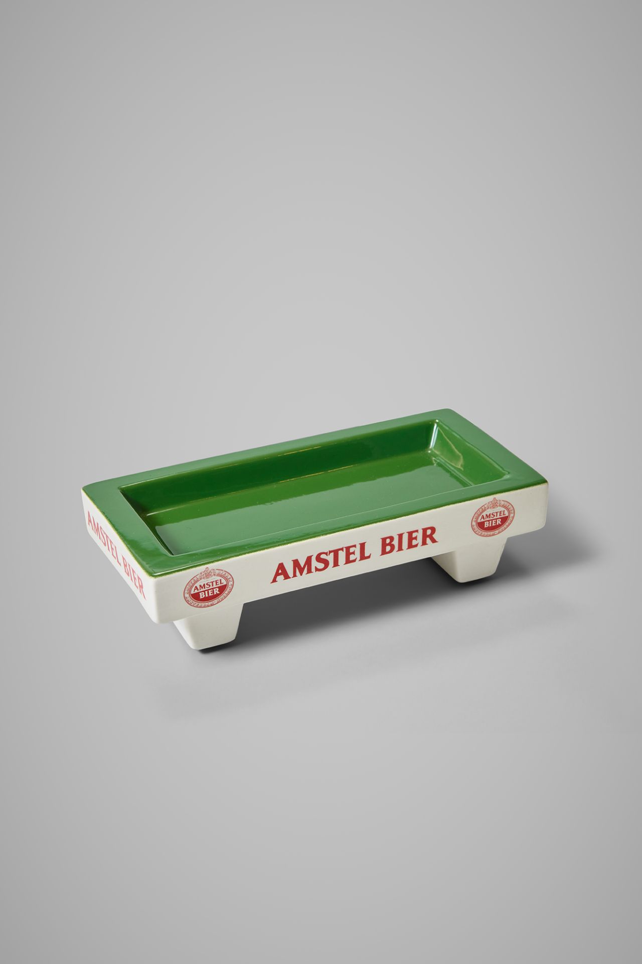
Billiard players enjoying beer
Old times come alive with this billiard table-shaped 'change tray.' Who's still carrying small change these days, eh? Where have all the brown pubs gone, where there was always a change tray on the counter? Where in the background, men with rolled-up shirt sleeves, enveloped in cigar smoke, played a game on the green felt?
It simply vanished from the streetscape—along with the association of billiards with Amstel Beer. Fortunately, such advertising items were preserved in the Heineken Collection: a trophy, a prize in the form of a billiard table with balls, an Amstel billiard ball, and a billiard booklet with rules. But where did this connection actually come from?
A romantic tale
It is said that the circular, red-and-white Amstel logo was derived from the game of billiards because the founders enjoyed playing it. The Amstel website has a romantic story:
In Amsterdam, Charles de Pesters married Petronella, the sister of Johannes van Marwijk Kooy. Charles and his brother-in-law became good friends and, out of friendship, began brewing beer together. Johannes was 23 years old when he, along with his close friend Charles, founded De Amstel Brewery. Charles and Johannes enjoyed playing billiards. The red and white ball can still be seen in the Amstel Logo.

Red-white
However, according to others, the so-called bull's-eye logo, designed in 1952, looks the way it does simply because of the connection between red and white and Amsterdam: the city where De Pesters and Van Marwijk Kooy founded their brewery in 1870. This theory aligns with the colour choice for Heineken's earliest red and white bottle labels for the beer brewed in his first Amsterdam brewery, De Hooiberg (The Haystack). The association with billiards may have emerged after the Amstel rulebook was issued in 1955, with the logo on the cover depicted as a 'billiard ball.'

Friendship
Undoubtedly, Messrs. Pesters and Van Marwijk Kooy truly preferred billiards, and the fact that, in addition to being brothers-in-law, they were also best friends is likely not exaggerated. ‘Real’ men and male friendship were useful ingredients for the storytelling surrounding the Amstel beer brand, as it dominated its advertising well into the 1960s. This gradually began to change under the influence of feminism. Typical 'manly things' joined company with 'womanly things,' and nowadays little distinction is made between them to the extent possible.
I am what I am
Friendship has always remained the common denominator. Through that perspective, inclusivity became an important theme for Amstel in more recent years. For example, in the brand's positioning in Brazil, where Amstel advocates for the emancipation of the LGBTQIA+ community, notably through the ‘I am what I am’ campaign (2021).