INFO
Koninklijke Stempelfabrieken Posthumus
Stamp H.B.M. in a star
1930-1950
brass, wood
10 x 3.2 x 3.5 cm
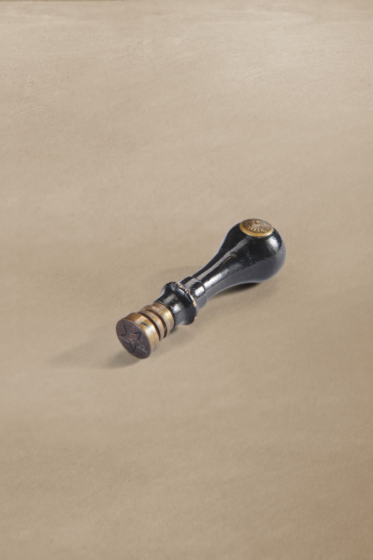
Star stamp
In our era of e-mail and online authentication, it’s easy to forget that not so long ago almost everything in the office was done manually with... stamps. Signatures, dates, checks, and approvals: there was a stamp for virtually every administrative task. This logo stamp comes from the possession of Mr J. Sluijter, who worked at Heineken Amsterdam from 1932.
As a clerk, Sluijter daily worked through a pile of paper documents that needed to be dated, read, forwarded, checked, answered, or archived. This process was somewhat 'automated' with the help of stamps and ink pads. During that time, any relatively important person, certainly the clerk, had a stamp with their own name.
Magical
This stamp features the logo of Heineken's Bierbrouwerij Maatschappij NV: a five-pointed star with the abbreviation 'H.B.M.' inside it. The star first appeared on a Heineken export bottle beer label in 1884. Founder Gerard Adriaan Heineken chose a star in reference to an ancient alchemical symbol, the Brauerstern, (Brewer’s Star) but with five instead of six points. According to the contemporary interpretation, four of the points represented the ingredients barley, hops, water, and yeast while the fifth stood for the magic of brewing. On the oval labels of the earliest Heineken advertisements from the late 19th century, the star is white with black outlines, with the trademark HBM inside – exactly like this stamp.

White-red-white
On the labels, the filling of the Heineken star was transformed over time from white to red and back. On the rectangular label introduced by Heineken for the Dutch market in 1931, the star appears in red, with slightly longer 'legs.' The company name was shortened to 'Heineken's' – first with and later without the apostrophe – but the abbreviation H.B.M. in the star remained for a while. After World War II, Heineken changed the star in the Netherlands to white with an inconspicuous red border. Unfortunately, the story doesn’t mention whether Mr Sluijter exchanged his black stamp ink for frivolous red at the time.
In 1954, Heineken devised a completely new logo and the star stamp became a curiosity. Its owner saw many more stamps come and go: he only retired in 1995, after 63 years of loyal service.
